 5643f8f6d2
* Added docs with new screenshots

* Added doc to architecture

* Added documentations to various extension modules

* Added more documentation to modes

* Added docs to managers

* Added docs for services

* Fixed deployment docs

* Added white labelling documentation

* Added i18n docs and measurement export
7.6 KiB
Module: Toolbar
An extension can register a Toolbar Module by defining a getToolbarModule
method. OHIF-v3's default extension ("ohif.org.default") provides 5 main toolbar button types:
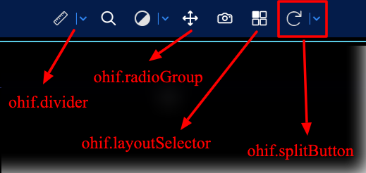
Example Toolbar Module
The Toolbar Module should return an array of objects. There are currently a few different variations of definitions,
each one is detailed further down.
export default function getToolbarModule({ commandsManager, servicesManager }) {

  return [
    {
      name: 'ohif.divider',
      defaultComponent: ToolbarDivider,
      clickHandler: () => {},
    },
    {
      name: 'ohif.action',
      defaultComponent: ToolbarButton,
      clickHandler: () => {},
    },
    {
      name: 'ohif.radioGroup',
      defaultComponent: ToolbarButton,
      clickHandler: () => {},
    },
    {
      name: 'ohif.splitButton',
      defaultComponent: ToolbarSplitButton,
      clickHandler: () => {},
    },
    {
      name: 'ohif.layoutSelector',
      defaultComponent: ToolbarLayoutSelector,
      clickHandler: (evt, clickedBtn, btnSectionName) => {},
    }
  ]
}
Toolbar buttons consumed in modes
Below we can see a simplified version of the longitudinal mode that shows how
a mode can add buttons to the toolbar by calling ToolBarService.addButtons(toolbarButtons).
toolbarButtons is an array of toolDefinitions which we will learn next.
export default function mode({ modeConfiguration }) {
  return {
    id: 'viewer',
    displayName: 'Basic Viewer',

    onModeEnter: ({ servicesManager, extensionManager }) => {
      const { ToolBarService } = servicesManager.services;

      ToolBarService.init(extensionManager);
      ToolBarService.addButtons(toolbarButtons);
    },
    routes: [
      {
        path: 'longitudinal',
        layoutTemplate: ({ location, servicesManager }) => {
          return {/* */};
        },
      },
    ],
    extensions: [
      'org.ohif.default',
      'org.ohif.cornerstone',
      'org.ohif.measurement-tracking',
      'org.ohif.dicom-sr',
    ],
  };
}
Button Definitions
The simplest toolbarButtons definition has the following properties:
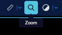
{
  id: 'Zoom',
  type: 'ohif.radioGroup',
  props: {
    type: 'tool',
    icon: 'tool-zoom',
    label: 'Zoom',
    commandOptions: { toolName: 'Zoom' },
  },
},
| property | description | values |
|---|---|---|
id |
Unique string identifier for the definition | * |
label |
User/display friendly to show in UI | * |
icon |
A string name for an icon supported by the consuming application. | * |
type |
Used to determine the button's behaviour | "tool", "toggle", "action" |
commandName |
(optional) The command to run when the button is used. | Any command registered by a CommandModule |
commandOptions |
(optional) Options to pass the target commandName |
* |
There are three main types of toolbar buttons:
tool: buttons that enable a tool by running thesetToolActivecommand with thecommandOptionstoggle: buttons that acts as a toggle: e.g., linking viewportsaction: buttons that executes an action: e.g., capture button to save screenshot
Nested Buttons
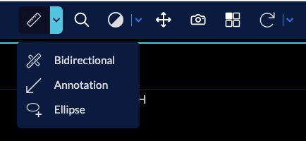
You can use the ohif.splitButton type to build a button with extra tools in the dropdown.
- First you need to give your
primarytool definition to the split button - the
secondaryproperties can be a simple arrow down (chevron-downicon) - For adding the extra tools add them to the
itemslist.
You can see below how longitudinal mode is using the available toolbarModule to create
MeasurementTools nested button
// modes/longitudinal/src/toolbarButtons.js

{
  id: 'MeasurementTools',
  type: 'ohif.splitButton',
  props: {
    groupId: 'MeasurementTools',
    isRadio: true,
    primary: {
      id: 'Length',
      icon: 'tool-length',
      label: 'Length',
      type: 'tool',
      commandOptions: {
        toolName: 'Length',
      }
    },
    secondary: {
      icon: 'chevron-down',
      label: '',
      isActive: true,
      tooltip: 'More Measure Tools',
    },
    items: [
      // Length tool
      {
        id: 'Length',
        icon: 'tool-length',
        label: 'Length',
        type: 'tool',
        commandOptions: {
          toolName: 'Length',
        }
      },
      // Bidirectional tool
      {
        id: 'Bidirectional',
        icon: 'tool-bidirectional',
        label: 'Length',
        type: 'tool',
        commandOptions: {
          toolName: 'Bidirectional',
        }
      },
      // Ellipse tool
      {
        id: 'EllipticalRoi',
        icon: 'tool-elipse',
        label: 'Ellipse',
        type: 'tool',
        commandOptions: {
          toolName: 'EllipticalRoi',
        }
      },
    ],
  },
}
Layout Template
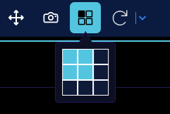
Layout selector button and logic is also provided by the OHIF-v3 default extension.
To use it, you can just add the following definition to the list of toolDefinitions
{
  id: 'Layout',
  type: 'ohif.layoutSelector',
}
Custom Button
You can also create your own extension, and add your new custom tool appearance (e.g., split horizantlly instead of vertically for split tool).
Simply add getToolbarModule to your extension, and pass your tool react component to its
defaultComponent property in the returned object.
You can use @ohif/ui components such as IconButton, Icon, Tooltip, ToolbarButton to
build your own component.
import myToolComponent from './myToolComponent'


export default function getToolbarModule({ commandsManager, servicesManager }) {

  return [
    {
      name: 'new-tool-type',
      defaultComponent: myToolComponent,
      clickHandler: () => {},
    },
  ]
}
Custom tool
I want to create a new tool