 a90605c82d
* feat: 🎸 React custom component on toolbar button

Toolbar button can consume/render react custom components. Its only
required to expose the component into toolbar definitions
(toolbarModule)

Closes: 924

* feat: 🎸 Core review. Minor changes on documentation

Closes: 924

* feat: 🎸 Code review

* feat: 🎸 Code review. Changing function call to variable decl
8.5 KiB
Extensions
Extensions add new functionality to the viewer by registering one or more modules. They go one step further than configuration in that they allow us to inject custom React components, so long as they adhere to the module's interface. This can be something as simple as adding a new button to the toolbar, or as complex as a new viewport capable of rendering volumes in 3D.
Overview
At a glance, an extension is a javascript object that has an id property, and
one or more "module" methods. You can find an abbreviated extension below, or
view the source of our example extension.
export default {
    /**
     * Only required property. Should be a unique value across all extensions.
     */
    id: 'example-extension',

    /**
     * Registers one or more named commands scoped to a context. Commands are
     * the primary means for...
     */
    getCommandsModule() {
        return {
            defaultContext: 'VIEWER'
            actions: { ... },
            definitions: { ... }
        }
    },

    /**
     * Allows you to provide toolbar definitions that will be merged with any
     * existing application toolbar configuration. Used to determine which
     * buttons should be visible when, their order, what happens when they're
     * clicked, etc.
     */
    getToolbarModule() {
        return {
            definitions: [ ... ],
            defaultContext: 'ACTIVE_VIEWPORT::CORNERSTONE'
        }
    }

    /**
     * Not yet implemented
     */
    getPanelModule: () => null,

    /**
     * Registers a ReactComponent that should be used to render data in a
     * Viewport. The first registered viewport is our "default viewport". If
     * more than one viewport is registered, we use `SopClassHandlers` to
     * determine which viewport should be used.
    */
    getViewportModule: () => reactViewportComponent,

    /** Provides a whitelist of SOPClassUIDs the viewport is capable of rendering.
     *  Can modify default behavior for methods like `getDisplaySetFromSeries` */
    getSopClassHandler: () => {
        id: 'some-other-unique-id',
        sopClassUids: [ ... ],
        getDisplaySetFromSeries: (series, study, dicomWebClient, authorizationHeaders) => { ... }
    },
}
Modules
There are a few different module types. Each module type allows us to extend the
viewer in a different way, and provides a consistent API for us to do so. You
can find a full list of the different types of modules
in ohif-core. Information on each type of module, it's API,
and how we determine when/where it should be used is included below.
NOTE: Modifying the extensions/modules registered to the OHIF Viewer currently requires us to import and pass extensions to the ExtensionManager in
src/App.js, then rebuild the application. Long-term, we intend to make it possible to accomplish this without a build step.
Commands
The Commands Module allows us to register one or more commands scoped to specific contexts. Commands can be run by [hotkeys][#], [toolbar buttons][#], and any registered custom react component (like a [viewport][#] or [panel][#]). Here is a simple example commands module:
{
    getCommandsModule() {
        return {
            actions: {
                speak: ({ viewports, words }) => {
                    console.log(viewports, words);
                },
            },
            definitions: {
                rotateViewportCW: {
                    commandFn: actions.rotateViewport,
                    storeContexts: ['viewports'],
                    options: { rotation: 90 }
                },
                rotateViewportCCW: {
                    commandFn: actions.rotateViewport,
                    storeContexts: ['viewports'],
                    options: { rotation: -90 },
                    context: 'ACTIVE_VIEWER::CORNERSTONE'
                },
            },
            defaultContext: 'VIEWER'
        }
    }
}
Viewport
An extension can register a Viewport Module by providing a getViewportModule()
method that returns a React Component. The React component will receive the
following props:
children: PropTypes.arrayOf(PropTypes.element)
studies: PropTypes.object,
displaySet: PropTypes.object,
viewportData: PropTypes.object, // { studies, displaySet }
viewportIndex: PropTypes.number,
children: PropTypes.node,
customProps: PropTypes.object
Viewport components are managed by the LayoutManager. Which Viewport component
is used depends on:
- The Layout Configuration
- Registered SopClassHandlers
- The SopClassUID for visible/selected datasets
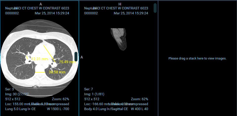
For a complete example implementation, check out the OHIFCornerstoneViewport.
Toolbar
An extension can register a Toolbar Module by providing a getToolbarModule()
method that returns a React Component. The component does not receive any props.
If you want to modify or react to state, you will need to connect to the redux
store.
The given toolbar must determine its set of elements and the context of them. The set of elements will be listed on toolbar definitions.
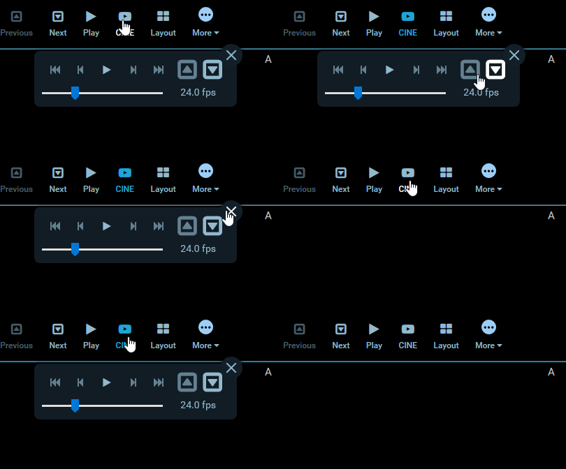
Toolbar components are rendered in the ToolbarRow component.
For a complete example implementation, check out the OHIFCornerstoneViewport's Toolbar Module.
Toolbar Custom Component
Toolbar elements can define its own custom react component to be consumed when rendering it. So far, it accepts Functional and Class Components. For that, you just need to expose your CustomToolbarComponent as the value of key CustomComponent. In case the property CustomComponent is not present, a default toolbar component will be used to render it. See bellow
definitions: [
...
    {
        id: 'Custom',
        label: 'Custom',
        icon: 'custom-icon',
        CustomComponent: CustomToolbarComponent,
    }
...
]
CustomComponent components will receive the following props:
- parentContext: parent context. (In most of the cases it will be a ToolbarRow instance)
- toolbarClickCallback: callback method when clicking on toolbar
- button: its own definition object
- key: react key prop
- activeButtons: list of active elements
- isActive: if current
SopClassHandler
...
Panel
The panel module is not yet in use.
Hotkeys
...
Registering Extensions
Extensions are registered for the application at startup. The
ExtensionManager, exposed by ohif-core, registers a list of extensions with
our application's store. Each module provided by the extension becomes available
via state.plugins.availablePlugins, and consists of three parts: id, type
(PLUGIN_TYPE),
and the return value of the module method.
In a future version, we will likely expose a way to provide the extensions you would like included at startup.
app.js
import { createStore, combineReducers } from 'redux';
import OHIF from '@ohif/core';
import OHIFCornerstoneExtension from 'ohif-cornerstone-extension';

const combined = combineReducers(OHIF.redux.reducers);
const store = createStore(combined);
const extensions = [new OHIFCornerstoneExtension()];

// Dispatches the `addPlugin` action to the store
// Adding extension modules to `state.plugins.availablePlugins`
ExtensionManager.registerExtensions(store, extensions);
OHIF Maintained Extensions
A small number of powerful extensions for popular use cases are maintained by
OHIF. They're co-located in the
OHIF/Viewers repository, in the top level
extensions/
directory.
{% include "./_maintained-extensions-table.md" %}